

I totally forgot to write a response to Julia Walker. Julia Walker talked about how architecture has changed over the years with the idea of sustainability. The overall lecture was pretty interesting but it was just too short for the subject matter. I felt like the most entertaining aspects of her presentation came from discussing houses that looked like case study houses like the Eames. The big red one that was in Malibu was my favorite. Walker talked a lot about houses that were made completely out of straw and tires and earth but I didn't see any examples. I just wish it didn't feel as rushed as it did because it is a very broad subject that have wonderful contributions to our lives in the coming years.
Thursday, December 10, 2009
Wow.....kind of late.
Tuesday, December 8, 2009
Tuesday, December 1, 2009
Monday, November 23, 2009
Video composites. Rough Cuts.
Here are a few rough cuts that I compiled together for like the first layer of my animation. I know there are some major icky parts but I also feel like there is some great experimentation going on. The major issue is resolution within these short clips and I will be able to fix that by just exporting my vectors at a higher dpi. The next step is to add the second layer of automatic drawing on top then add in the scene of it panning out.
COMPOSITE ONE:
Composite One from qaaim goodwin on Vimeo.
COMPOSITE TWO:
Composite Two from qaaim goodwin on Vimeo.
COMPOSITE THREE:
Composite Three from qaaim goodwin on Vimeo.
COMPOSITE FOUR:
Composite Four from qaaim goodwin on Vimeo.
Thursday, November 19, 2009
Tuesday, November 17, 2009
UPDATES
I didn't know that it would take freaking forever to get a stable result from the bulge effect but overall I am learning how to control it more so my initial test is pretty sloppy...but I am having fun.
Tuesday, November 10, 2009
Assets Checklist, Schedule, and Concept Revision
Revision:
New animatic from qaaim goodwin on Vimeo.
Schedule:
Thursday, Nov. 12 -
HAVE MAJORITY OF MY ASSETS DONE AND READY FOR REVIEW.
Tuesday, Nov. 17 -
START PRODUCING SOME OF THE SCENES AND EDITING FOOTAGE OF ANYTHING THAT IS DONE.
Thursday, Nov. 19 -
GET A FINAL REVIEW BEFORE THE BREAK OF WHERE I AM WITH MY SCENES AND POSSIBLY HAVE SOME MUSIC PICKED OUT. PREP THE PROJECT FOR PRODUCTION OVER BREAK.
Tuesday, Nov. 24 -
SHOW UP WITH A HALFWAY DECENT OVERALL RUN THROUGH OF WHAT THE ANIMATION IS AND MAKE ANY NECESSARY REVISIONS.
Thursday, Nov. 26 -
WORK ON THE KINKS AND START TO TIGHTEN UP THE ANIMATION. HAVE IT READY FOR REVIEW.
Tuesday, Dec. 1 -
CONTINUE TO WORK ON FIXING ANYMORE PROBLEMS AND EDIT THE FINAL VERSION.
Thursday, Dec. 3 -
HAVE A FULL RUN THROUGH ON THE FINAL AND CONTINUE TO HAVE REVIEWS ON IT.
Tuesday, Dec. 8 -
LAST CHANCE TO DO ANY MAJOR CHANGES.
Thursday, Dec. 10 -
FINAL IS DUEEEE!!!
Asset Checklist:
Textures:
A. paint splatters
B. ink washes
C. coffee stains
D. brush marks
E. cardboard background
Subject:
A. Multiple compositions ready to be overlayed.
B. Composites done in 3D of background activity.
Colors:
A. Study and find colors that evoke a certain emotion.
Music:
A. Possibly compose or find royalty free music that helps push the concept of the automatic drawing.
Render:
A. RENDER OUT EACH PIECE SEPARATELY TO CUT DOWN ON OVERALL RENDER TIME. TAKE THIS SHIT INTO FUCKING CONSIDERATION!!!!!
storyboards and attempt at animatic
Overall Image:


Animatic:


I really tried to come up with something in my head that would make sense for a complete animation and it took freaking forever because I was thinking a lot about the aesthetics and trying to convey some type of story. The only thing that I could think of in terms of revising a synopsis is having a piece already pre-made into seperate parts and just have itself appear to be drawing. On top of that I want to add more complexity to it by having a way to show it all without having to zoom in and out. So now I am thinking largely about how scenes were handled in the 60s and 70s with split screens and such. The animatic on the other hand wasn't a complete failure but it didn't do much for me because I couldn't think of any actions at the time. So instead I did further research to try and flesh out my idea a little more which is included in this post.
Animatic:
animatic from qaaim goodwin on Vimeo.
Additional Research:
Robert Hardgrave:http://www.roberthardgrave.com/
Eyvind Earle:http://www.gallery21.com/serigraphs_eyvind_earle.htm
Split-Screens:http://forums.klipsch.com/blogs/moviesandtv/archive/2009/08/05/cinematic-style-1970s-split-screen.aspx
Thursday, November 5, 2009
MASTER CLASS! - BILL PLYMPTON
I was super excited to see Bill Plympton and have a master class with him. I grew up with seeing his illustrations and animations thanks to my older brother. I loved his master class because seeing his process was really enlightening. I can't say enough that his style is just so prominent with the sketchiness that I would hate to see it fully rendered out "Disneyesque". After the lecture he gave me some valuable insight on who he was before becoming an animator. He told me that he started out as a graphic designer to help support himself and it launched into an animation career because of his love for drawing. If you work hard enough for your dream it will come true in some fashion. I admire that honesty because most artists would sugar coat it.
Monday, November 2, 2009
Final Project Idea
GENRE
Experimental
LOGLINE
Expression of the self through the fluidity of line.
SYNOPSIS
The idea is not to produce a piece that conveys any true story or emotion but to allow the viewer to draw whatever they are feeling from the imagery. The movie invokes the viewer's intuition and opens up their mind to tell a story or emotion.
VISUAL DEVELOPMENT
http://www.behance.net/Gallery/Fusion/174737
http://www.behance.net/Gallery/Lake-Shore-Illustrations/198008
http://www.behance.net/Gallery/Little_ampLarge-Font/191195
http://www.behance.net/Gallery/experimental-mess/51675
http://www.behance.net/Gallery/Lovestruck/300780
http://www.motionserved.com/Gallery/LITTLE-HOOLIN/312007
seperate example
http://www.motionserved.com/Gallery/surface-trailer/292882
http://www.motionserved.com/Gallery/RAW-POWER/328014
Thursday, October 29, 2009
Mid-Term Revise 2
Mid-Term Ball: Psychoanalysis from qaaim goodwin on Vimeo.
For this one I kind of took a leap to end the animation early while trying to keep some of the elements from the previous versions. The main thing to do was to design the animation around my hardware so that it could run to a certain degree. I found that adding too many segments to the objects in one scene would slow down the render considerably....where as if the object was moving super fast with the camera pushed further away...it ran normal. Just overall crazy calculations I didn't think of before until now. This isn't the final clip because I am currently rendering a fully detailed version of this and I will post it once it is done.
Tuesday, October 27, 2009
mang!
REVISED MID TERM from qaaim goodwin on Vimeo.
Never do 3D with after effects unless you really have the time. I am so swamped with work that I am wondering how I got through this. I feel that I resolved some issues that were bothering me and I hopefully addressed the comments. As far as the three different parts they are suppose to represent three different parts of myself. The little circle menu is suppose to signify going into my mind to see my inner workings. I need to emphasize that aspect a little more. I like merging two programs together but I am hating the huge files but that comes with the territory.
Wednesday, October 21, 2009
MID-TERM ROUGH DRAFT
Psychoanalysis of Q Rough Cut from qaaim goodwin on Vimeo.
Ok. I know what you are thinking about my project. Why is it different from what I proposed? Well my reasoning for that was it didn't make any sense to me with what I came up with as a concept. It felt kind of rushed and plus it would involve the viewer trying to attach itself to a creature that didn't have human features. My secondary idea to this was to focus on myself as a subject. My revised idea is now to explore my mind and see what is ticking in there. Nothing in the video is really what I think about all the time but it is funny how I try to put imagery to the different parts. This is pulling forth from the first concept of how to show an emotion visually. A great deal of this video is made in Cinema 4D to have a better understanding of the program and the integration it has with After Effects. A great deal of troubleshooting has been done to get to a functional point in the mid-term project. I still have a lot of work to do for this project especially for the individual scenes for the sections. Right now they are incomplete because they are not my final vision....they are sort of place holders so I can see what type of motion I want.
Monday, October 12, 2009
Mid-Term Concept
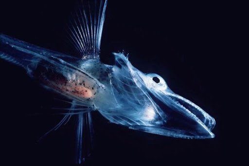
My idea for the mid-term dynamic imaging project centers around the self. I want to take viewers on a wild ride into the dark abyss of the subconscious. I am basing majority of my concept off of the writings of Joseph Campbell who points out in mythology that the subconscious mind is represented by water. To represent the viewer when watching this animation I chose the jellyfish because of the different species found in the abyss of the ocean. The very thought of being surrounded by absolute darkness everyday conjures up the feeling of claustrophobia. We begin this journey into our own mind by witnessing a group of jellyfishes coming on screen and interacting with its environment. The next split second we are zooming into the jellyfish and watching how the brain works with these quick bursts of electrons hitting it.
The brain begins to open up and suck us in to it. Inside we witness a lot of nothingness until ink splatters begin to drop on top screen growing larger and larger. Soon black particles are rushing outward towards the screen filling it with complete blackness. Slowly emerging from the darkness are some familiar shapes of a landscape. We now notice that we are floating in a dark cave and we feel trapped because we don't see a way out. Soon words begin to appear illuminating the space that question why we are here and what we are feeling. We try to ignore them but they begin to shift into odds shapes and form imagery that leaves us confused. Why are we thinking these thoughts? We wouldn't normally think this way but we are trapped and don't know anything? Just before we completely lose it a bright flash happens and we are suddenly being sucked forward at warped speed. Before we can gather ourselves we find ourselves outside of the jellyfish wondering what we just saw. The jellyfish begins to swim away quickly.

INFLUENCES FOR STYLE/CONCEPT:
http://www.bogleech.com/bio-deepjelly.html
http://www.behance.net/Gallery/Change-is-The-Only-Constant-Dickmans-Design/121895
http://www.behance.net/Gallery/Glow-in-the-Ocean/200023
http://www.behance.net/Gallery/jellyfishes/85682
http://video.nationalgeographic.com/video/player/specials/editors-picks-specials/atmosphere/arctic-abyss-under-the-ice.html
http://ngm.nationalgeographic.com/ngm/0505/feature4/
http://media.photobucket.com/image/fish%20of%20the%20abyss/joserouse/Animals/Fish/Abyss/transparent.jpg
http://lh5.ggpht.com/abramsv/SBAxWCdoyGI/AAAAAAAAPPw/dx8B68QQD0E/1265997134_55201eb73b_o.jpg
http://graphics8.nytimes.com/images/2007/05/22/science/22deep_extra.jpg
Thursday, October 8, 2009
Conceptual Ideas
Some of my ideas will certain around more so the mind and exploring it. My idea is sort of showing a very abstract structure of someone's brain and the ideas that float around. Taking in some of the theories from mythologies class about how water can be symbolized as the unconscious mind. I think this would be fun because it could be a really expanded, crazy look at the hero's adventure. The subject matter of it may have to go completely away from some of the subjects I originally posted but it may be awesome to see a take on stuff by Joseph Campbell.
Another idea that I was shooting around was more about modernizing what surrealism is to me. Making more of a designed look to it that plays on composition. Personally I feel that a lot of my work is just becoming textured and crazy...I like that but I don't want to completely limit myself. Maybe focusing on developing a balance between the simple and detailed.
These are my two main ideas because I feel that I need to focus more on the areas of concept, design, and composition. There should always be a balance but it should also push me some more to get out of the normality of a style.
Freud Matte
Freud Matte from qaaim goodwin on Vimeo.
I couldn't think of something super awesome for using mattes other than making a wacky looking sequence that seems cut out of a PBS documentary. I played around with some features from the Riot Gear plugins pack as a secondary path but it didn't really enhance it. I have to think ahead about the use of mattes before diving right in to them. Just another day of learning.
Tuesday, October 6, 2009
Puppet Tool Test
Eye Guy Dance from qaaim goodwin on Vimeo.
I didn't accomplish much with the puppet tool but I can understand how powerful of a tool it can be when used in the right situation. At this moment I am at a lost for real imagery to convey although I am sure there is a large abundance of it out there. This animation is really simple in an attempt to understand the tool rather than go crazy with it like my fellow peers. I feel sort of out disconnected to the tool though because I prefer animating a character from scene to scene without after effects doing it for me. That is my only gripe about the tool. Other than that I just need to find the time to work on a great animation.
Tuesday, September 29, 2009
VIDEO CO-PILOT EXPERIMENT(S)
Streaking Experiment from qaaim goodwin on Vimeo.
This was a cool tutorial to do because I was always wondering how they achieved this effect for title sequences. My only thing about it is trying to find a way to push it some more. I want to go super crazy and make it more fluid like floating water. As far as revising my typography assignment.....I am currently rendering and testing out some techniques in Cinema4D that may add some depth to my work. It is ten times easier to lay out some 3D camera work and then import that data into After Effects. This is what I am working on. I will post some examples and a finished product after everything is completely rendered.
Monday, September 28, 2009
Cause And Effect
Cause And Effect from qaaim goodwin on Vimeo.
After watching a few video pieces on Saul Bass one in particular inspired me to just keep it straight forward and simple. It was the title sequence for The Human Factor that made me feel that keeping it this way, then my point will shine through. I got a better understanding of the text tool and I am always experimenting to better myself. I am happy about this one.
Researching Studio
As much as I give a lot of credit to Saul Bass for making very beautiful title sequences and credit rolls I kind of figure I need to see what people are doing presently. I really want to see how they focused typography and composition with their motion graphics. This is when I stumbled across a studio known as MK12 - http://www.mk12.com.
MK12 was formed in Kansas City around the early part of 2000. The company was founded by Ben Radatz, Jed Carter, Matt Fraction, Shaun Hamontree, and Tim Fischer whom are all graduates of Kansas City Art Institute. There big break came from outside investors that saw their freelance web work and pushed them to try for more ambitious projects. MK12's aesthetics are derived for their love for strong narratives and good design. They keep their prospective on the design community fresh by taking on in-house projects that are posted on their web site.
Pop culture seems to have a major contribution to their work and the execution of their themes are key to their success. MK12 has a wide array of clients from NBC, CBS, HBO, to the New York Times. Some of their most recent work can be seen in Quantum of Solace. I personally find their work very attractive in how they convey the material they are contracted for. What caught my eye was the visuals for the opening sequence to Stranger Than Fiction. ( http://media2.mk12.com/v5_qt_html/2007/stf_opening_sequence.html ). Watching how the typography interacted with the lead character was pretty amazing to me. It made me feel as if I was OCD and I could go along with the character from day to day as he counted his steps, or made major bank calculations. Another impressive piece would be their sequence for Kite Runner that can be seen here http://www.youtube.com/watch?v=G952eVWouv4. Again the part that attracts me is their dedication to capturing the culture of the material, and their ability to stick close to the aesthetics they put on themselves.
Wednesday, September 23, 2009
WTF
Quick Animation Test from qaaim goodwin on Vimeo.
Well this Mask experiment was kind of eh.....I got irritated with it because the idea I wanted to do would mean a bunch of time to produce it. Something that I didn't have these past couple of days. So I at least attempted half of my idea to try and flesh out some motion. I need to re-evaluate my topic for the semester because I have this feeling that I should expand outward from just this Surrealist style. I should give myself more room to play. We will see how that goes.
Monday, September 21, 2009
Lecture Brief: Janet Koplos
I thought the lecture on Thursday night was excellent. Janet Koplos was very well spoken and you could see how interested she was in her topic of artwork that had a long process. The pieces shown were beautiful and I got a bigger picture of artists I had never heard of. Some of the highlights from the lecture included Koplos stating that the process of creating a piece can be just as beautiful as the finished look. This was something that I completely connected with because I think development is one of the steps that shows where your complete thoughts are. Process and research are steps that I really believe in with my work because it aids the concept. Composition and overall design needs to be put on the back burner until all the elements are thought out. Who knows that in the middle of doing the process and research you may find a new way to present your work that no one has seen. My major problem with the lecture though were some of the students who apparently didn't understand that a speaker was up front. I hate when people are rude especially to someone with knowledge of artwork I have never seen or experienced.
Favorite Artists From Lecture:
Yoshihiro Suda
Tom Friedman
Tara Donovan
Roman Opalka
Anne Wilson
Tim Hawkinson
Aeneas Wilder
Commercialism
Commercialism galore from qaaim goodwin on Vimeo.
This was the longest assignment that I have ever worked on but I really liked the outcome. The idea for this came from talking to a few of my animation buddies and my good painting friend. Crazy Bien. The subject matter is something that I should explore a little more because as a designer not only am I affected by it but I am affecting everyone else through my work.
Thursday, September 17, 2009
OH BOY!
Political Ladybug from qaaim goodwin on Vimeo.
I don't know what to really say about this one in particular. I like it a lot because of what I was trying to achieve after reading mounds of posts on international forums of politics....but I don't know how I feel about it technically. I read so many tutorials on expressions and how to execute them to stay up to date for class, but they all fell short. I watched a few videos on Expression Controls but I don't think that is the way we were suppose to handle it. My expressions never really worked for I ended up having to copy and paste some secondary actions in my project to keep the flow.
Tuesday, September 15, 2009
Experiment 2 Write up
Modern Surrealism Try from qaaim goodwin on Vimeo.
I don't know how I feel about the experiment this week because I feel I can do so much more than this. I was trying to get an obvious attempt at showing a message with my concept. I am going to upload some storyboards later today to flesh out my idea. I think this is a great attempt at figuring the mechanics of the animation.
Thursday, September 10, 2009
Revise Comments
Surrealism Revise from qaaim goodwin on Vimeo.
For the revise I totally forgot to jot down my thoughts here over the days we were out of the class. When I look at the piece now I still feel that like some of my elements could be slowed down some more. I also don't know what is up with the eye flash. I thought it was pretty cool when I did it but now when I view it....I don't know. I need to re-think some shit.
Tuesday, September 8, 2009
Monday, September 7, 2009
Proposal
My idea for a semester topic is to take the art movement of Surrealism and apply to different themes that affect us from day to day. Using what I have learned from my research on Surrealism and abstract art I want to create pieces that are living satires on the issues. The themes/topics that I want to explore are war, the soul, economy, family, and fear. I have never dealt with the topic of Surrealism or the major concepts behind what formed the movement but through conceptual development of the topics into pieces I would be able to have a better understanding. Imagery will play a major role in the construction of each piece as will conveying the concept through a strong composition.
Research
Here are my library/internet sources.
1. Homage to Max Ernst. Author: Gi di San Lazzaro
2. An Introduction to Surrealism. Author: J.H. Matthews
3. Fantastic Art, Dada, Surrealism. Author: Alfred H. Barr, Jr.
4. The Literary Origins of Surrealism: A New Mysticism in French Poetry. Author: Anna Balakian
5. Cubism and Abstract Art. Author: Alfred H. Barr, Jr.
6. Dali and Postmodernism. Author: Marc J. LaFountain
7. The Dali Universe. Beniamino Levi
8.http://www.spiritus-temporis.com/surrealism/history-of-surrealism.html
9.http://beinart.org/forum/
10.http://www.artcyclopedia.com/artists/durer_albrecht.html
11.http://www.cnn.com/
12.http://www.theonion.com/content/index
Wednesday, September 2, 2009
Word List
Similar:
1. Spirituality
2. Depiction
3. Unearthliness
4. Holiness
5. Piousness
6. Immateriality
7. Otherworldliness
8. Chorus
9. Verse
10. Repetition
11. Theme
12. Motif
13. Object
14. Idea
15. Structure
16. Concept
17. Design
18. Arrangement
19. Configuration
20. Style
21. Form
22. Construction
23. Surrealistic
24. Grotesque
25. Absurd
26. Abnormal
27. Deformed
28. Distorted
29. Weird
30. Whimsical
31. Futuristic
32. Modern
33. Supernatural
34. Sublime
35. Territory
36. Boundary
37. Region
38. Enclave
39. Ownership
40. Slavery
Opposing:
1. Confines
2. Open
3. Virtue
4. Vice
5. Devil
6. God
7. Cause
8. Effect
9. Aggressive
10. Calm
11. Bondage
12. Freedom
13. War
14. Peace
15. Justice
16. Unlawful
17. Destruction
18. Rebirth
19. Arouse
20. Annoy
21. Unfiltered
22. Censored
23. Background
24. Foreground
25. Blame
26. Praise
27. Clear
28. Vague
29. Economize
30. Waste
31. Feeble
32. Sturdy
33. Knowledge
34. Innocence
35. Minority
36. Majority
37. Wisdom
38. Folly
39. Voluntary
40. Compulsory
Wednesday, August 26, 2009
The Kid Stays in the Picture Review
I don't know about anyone else but this was my first time watching this film. Wow. I love films like this because they have a way of taking your attention and running with it. Nothing felt overdone in anyway and the fact that the images popped up and moved with the screen really fit what was going on. It added such depth to the overall story told by Mr. Evans. This is what I want to achieve with my content. I want to pull them in through simplistic techniques that add such raw content. Even though there were images used over and over in some scenes you could never really grow tired of what was being done because of the context they were being put in to. Bravo.
Three Possible Research Topics
Idea One:
I would really like to make a great intro movie that grabbed the viewer's attention and allowed for some level of interaction. So maybe blending after effects with flash. Could essentially make something like this but have the user control it just a little. That may be a little too much to think about.
Idea Two:
I thought it would be cool to take a MF DOOM song or any artist for that matter and create a nice video that corresponds to the lyrics and the rhythm. It could be really abstract and elegant or very out there and funky. Sort of like these videos.
Idea Three:
I want to make a really crazy commercial that is full of texture and crazy motion.
Examples : http://www.behance.net/Gallery/CARTOON-NETWORK-ID-_quotHALLOWEEN-SPECIAL_quot/158703
Orange Brand Video from Karolina Kret on Vimeo.
Tuesday, August 25, 2009
The Ken Burns Effect
Ah Sir Ken Burns. I remember watching his civil war and jazz series with my parents growing up. I could never put a finger on what he was famous for until art school. I didn't really understand how panning, zooming, and sliding transitions were so innovating at the time. I just thought that a computer did the work of the filmmaker and that was it. I recently watched an interview with Ken Burns on his technique and his thoughts about movies. I thought it was pretty good and it gave a great understanding into how he achieved said effects and the extra emotional pull it had on viewers.
Video:
In the Realms of the Unreal Review
I watched this film some time ago when I was a part of Society of Illustrators and they hosted big indie film nights. What always strikes me is the amount of work he did over a lifetime and the crap he went through growing up that made him dream up of these characters. The effects most definitely give life to his characters (the Vivian girls) and their adventures through war. Some of the imagery sort of gets to you especially the girls since they are sort of guys also. I don't know.....but what I do know is that the visuals being enhanced like they were just made everything seem like a storybook come to life. Like a refined kandinsky. Such a deep touching tale about Henry Darger and the world that occupied his apartment space/mind. Sadly the world never got to meet the man before he died.
Subscribe to:
Posts (Atom)